Nando's, Loyalty Admin Tool
How I increased daily support ticket completion by 50% redesigning a customer support tool
Project Overview
Role: Lead Product Designer
Team: 01 Designer, 01 PM, 02 Engineers
Timeline: Nov 2023 - Apr 2024 (further updates ongoing)
Platform: Web
Status: Live since March 2025
-27% time on task
Contextual filters and a restructured architecture cut the adjustment flow from 9 screens to 5
+86% ease of use
Replacing nested menu navigation with search-first meant users could find customers much quicker
SUS score increased from 39 to 91
From "Poor" (39) to "Best Imaginable" (91) after redesigning the architecture with advisors and restructuring how admin tasks are conducted
Project Overview
Role: Lead Product Designer
Team: 01 Designer, 01 PM, 02 Engineers
Timeline: Nov 2023 - Apr 2024
(further updates ongoing)
Platform: Web
Status: Live since March 2025
+86% ease of use
Replacing nested menu navigation with search-first meant users could find customers much quicker
-27% time on task
Contextual filters and a restructured architecture cut the adjustment flow from 9 screens to 5
SUS score increased from 39 to 91
From "Poor" (39) to "Best Imaginable" (91) after redesigning the architecture with advisors and restructuring how admin tasks are conducted
PROBLEM
Design the replacement for a loyalty tool so broken, it had its own internal nickname: Pain-tronix.
Business context
In 2025, Nando's completed a two-year migration away from their loyalty provider, Paytronix, to a new platform - saving the business a handsome amount of change per year.
The ask was to initially replicate what Paytronix can do, but I saw the opportunity to vastly improve the daily experiences of the users.
*
"
User interview, Customer Support Team
"We've been asking for a replacement for over 5 years."
*
"
User interview, Safety & QA Team
"Honestly I only know how to use it because someone's shown me. I couldn't figure a lot of it out."
INSIGHTS
What was slowing users down and which features are must-haves for the MVP
Understanding how teams used Paytronix
We couldn't rebuild every feature Paytronix has, so I conducted a card sorting with 14 members, across 7 teams
The card sorting prioritised which features are most used and highest priority for the new tool
Identifying why tasks took so long
Below is the current Adjust Wallet flow mapped out
The most used task by every team currently has 9 separate screens and 17 actions to take
There are also multiple points of potential error with no safeguarding in place
Paytronix scored below SUS industry average
A System Usability Scale survey across 18 advisors scored Paytronix at 39
Industry average is 68 - below 50 is failing
This alone gave me leverage to push for the redesign of a tool that would suit both user and the business

Three core insights were derived from the research
The research surfaced three things the business hadn't fully anticipated:
01
The tool didn't just slow users - it broke their trust
13/14 users I spoke to had to build workarounds for their daily tasks, and were not happy needing to do so.
02
High-priority tasks were not easily visible
Card sorting ranked search and wallet adjustments as top tasks - both over 6 clicks deep.
03
Information density made the UI unlearnable
40+ fields with no hierarchy meant users spent 10-40 seconds locating basic customer information.

Users simply couldn't continue using the same tool. What they had to deal with on a daily basis was preventing them from working efficiently, and effectively.
DECISIONS
01
Reduced the wallet adjustment flow from 9 screens to 5 while decreasing the likelihood of high-impact errors
Outcome
Reduced time on task by 27% whilst decreasing high impact errors both in testing and once the tool was built.
Constraint
The tool needed to support high volume, reversible actions across 10M+ loyalty accounts. Mistakes were difficult to recover from.
Problem
In Paytronix, the flow took 17 steps across 9 screens.
There was no confirmation step, no visibility of the outcome, and no easy recovery from mistakes. Errors meant either contacting engineering or trying to reverse actions before customers noticing - like giving someone 100 Rewards.
Decision
One flow, not many - Replaced multiple entry points with a single modal and type selector.
Make outcomes visible before action - Introduced confirmation with pre/post balances and persistent customer context.
Default the common case - Pre-selected "Central Support" to remove a 500 restaurant scroll (Central Support was right at the bottom).

Final direction
A single focused flow with clear intent, visible outcomes, and reduced decision overhead. Engineering concerns about combining flows did not materialise in testing.
02
Filtering nearly didn't ship in the MVP - Here's how I fought, and won, the case for it
Outcome
In V2 testing, advanced filtering had the highest immediate task-success rate of any feature in the tool - 93%. Advisors can now find specific transactions in under 10 seconds.

Engineering proposal
It will save 2 sprints of build time if we include in the MVP
Save filtering for V2/V3
Can focus our attention on Adjust Wallet and Edit Card status
"Paytronix doesn't have this so it's fine."
My argument
Filtering in testing dramatically cut time on task by ~27%
Reduces cognitive load for users
Higher ticket completion, which is better for business
"I'll trade filtering for pagination in the MVP."
Without filtering
Up to 15 years of transaction data to scroll through
With filtering
Find transactions in 3-4 clicks
Transaction History with no filter or pagination
[ Current Paytronix functionality ]
What I traded to keep in scope
✕
Pagination → V3
✕
Filtering reduces cognitive load more effectively
✕
Expandable row → V2
✕
Users can leave admin info directly in adjust wallet form
✕
Link to Orders Hub → V3
✕
Users can still access by manually entering info
✕
Impartial search → V4
✕
No unhappy path sadly, but more users wanted filtering
✓
Result: Filtering shipped in MVP
✕
It's now the second most used feature in the customer profile
Most-used customer profile features
User feedback
The results from Google Analytics, and continuous conversations with all teams, show that filtering is an imperative feature to their daily workflows.
03
Pivoted to search-first landing page after dashboard view failed in testing
Outcome
First-time learnability rose to 85%. Advisors reach the customer they're looking for in under 5 seconds.
Constraint + problem
The initial dashboard concept tested poorly. In every R1 feedback session, advisors ignored it and looked for search.
Decision
The mental model wasn't "let's resume past sessions", it was "find a customer to conduct tasks now. I then scrapped the dashboard and search became the entry point.
Sometimes the best decision is to throw out two weeks of work.
Simplified architecture
Killing the initial agreed approach resulted in a much more simplified architecture. This was a big contributing factor in overall time on task reduction and first-time learnability.

Initial proposed architecture
Finalised architecture
IMPACT
100 tickets: from 4h10 → 2h15 + 50%
daily completion.
Behind the numbers
I achieved this by removing friction points from most-used tasks - specifically wallet adjustments, customer search and customer transaction validation through advanced filters.
Users must be brought into the design process as early as possible when redesigning a legacy tool. This is exactly what I did, and it's paid off.

Operational scale
The Loyalty Admin Tool went live in March 2025, as Nando's began migrating over 10 million Loyalty accounts from Paytronix to the new provider.
This wasn't just a redesign of a tool, but it is the operational backbone of a massive loyalty programme in the UK.
Presenting in front of the Customer Team

There's 70 people in the audience here (I promise).
REFLECTION
Three things I'd do differently
Involve wider stakeholders earlier.
If I had brought everyone along for the journey like I did with the users it would have vastly improved buy-in.
Share research findings sooner.
Similarly with the above point - engineers would know exactly why I'm suggesting design patterns and features if I shared the reports long before the build.
Check both microphones before conducting an interview.
I may or may not have muted both my mic and the room's mic during a usability session. Something that's scarred me and now I diligently check 20 times before hitting record.
What's next?
V2 delivered impartial customer search, transaction drop-downs, and advanced filtering.
V3 is ongoing, informed by weekly check-ins with advisors through a dedicated Slack channel. The product is live and still being shaped by the people who use it.
Although the numbers are good, the thing that matters most is that 40 people daily no longer have to be shown how to use it by someone who struggled before them.

Nando's, Loyalty Admin Tool
How I increased daily support ticket completion by 50% redesigning a customer support tool
Project Overview
Role: Lead Product Designer
Team: 01 Designer, 01 PM, 02 Engineers
Timeline: Nov 2023 - Apr 2024
(further updates ongoing)
Platform: Web
Status: Live since March 2025
+86% ease of use
Replacing nested menu navigation with search-first meant users could find customers much quicker
-27% time on task
Contextual filters and a restructured architecture cut the adjustment flow from 9 screens to 5
SUS score increased from 39 to 91
From "Poor" (39) to "Best Imaginable" (91) after redesigning the architecture with advisors and restructuring how admin tasks are conducted
PROBLEM
Design the replacement for a loyalty tool so broken, it had its own internal nickname: Pain-tronix.
Business context
In 2025, Nando's completed a two-year migration away from their loyalty provider, Paytronix, to a new platform - saving the business a handsome amount of change per year.
The ask was to initially replicate what Paytronix can do, but I saw the opportunity to vastly improve the daily experiences of the users.
*
"
User interview, Customer Support Team
"We've been asking for a replacement for over 5 years."
*
"
User interview, Safety & QA Team
"Honestly I only know how to use it because someone's shown me. I couldn't figure a lot of it out."
INSIGHTS
What was slowing users down and which features are must-haves for the MVP
Understanding how teams used Paytronix
We couldn't rebuild every feature Paytronix has, so I conducted a card sorting with 14 members, across 7 teams
The card sorting prioritised which features are most used and highest priority for the new tool
Identifying why tasks took so long
Below is the current Adjust Wallet flow mapped out
The most used task by every team currently has 9 separate screens and 17 actions to take
There are also multiple points of potential error with no safeguarding in place
Paytronix scored below SUS industry average
A System Usability Scale survey across 18 advisors scored Paytronix at 39
Industry average is 68 - below 50 is failing
This alone gave me leverage to push for the redesign of a tool that would suit both user and the business
Three core insights were derived from the research
The research surfaced three things the business hadn't fully anticipated:
01
The tool didn't just slow users - it broke their trust
13/14 users I spoke to had to build workarounds for their daily tasks, and were not happy needing to do so.
02
High-priority tasks were not easily visible
Card sorting ranked search and wallet adjustments as top tasks - both over 6 clicks deep.
03
Information density made the UI unlearnable
40+ fields with no hierarchy meant users spent 10-40 seconds locating basic customer information.
Users simply couldn't continue using the same tool. What they had to deal with on a daily basis was preventing them from working efficiently, and effectively.
DECISIONS
01
Reduced the wallet adjustment flow from 9 screens to 5 while decreasing the likelihood of high-impact errors
Outcome
Reduced time on task by 27% whilst decreasing high impact errors both in testing and once the tool was built.
Constraint
The tool needed to support high volume, reversible actions across 10M+ loyalty accounts. Mistakes were difficult to recover from.
Problem
In Paytronix, the flow took 17 steps across 9 screens.
There was no confirmation step, no visibility of the outcome, and no easy recovery from mistakes. Errors meant either contacting engineering or trying to reverse actions before customers noticing - like giving someone 100 Rewards.
Decision
One flow, not many - Replaced multiple entry points with a single modal and type selector.
Make outcomes visible before action - Introduced confirmation with pre/post balances and persistent customer context.
Default the common case - Pre-selected "Central Support" to remove a 500 restaurant scroll (Central Support was right at the bottom).
Final direction
A single focused flow with clear intent, visible outcomes, and reduced decision overhead. Engineering concerns about combining flows did not materialise in testing.
02
Filtering nearly didn't ship in the MVP - Here's how I fought, and won, the case for it
Outcome
In V2 testing, advanced filtering had the highest immediate task-success rate of any feature in the tool - 93%. Advisors can now find specific transactions in under 10 seconds.
Engineering proposal
It will save 2 sprints of build time if we include in the MVP
Save filtering for V2/V3
Can focus our attention on Adjust Wallet and Edit Card status
"Paytronix doesn't have this so it's fine."
My argument
Filtering in testing dramatically cut time on task by ~27%
Reduces cognitive load for users
Higher ticket completion, which is better for business
"I'll trade filtering for pagination in the MVP."
Without filtering
Up to 15 years of transaction data to scroll through
With filtering
Find transactions in 3-4 clicks
Transaction History with no filter or pagination
[ Current Paytronix functionality ]
What I traded to keep in scope
✕
Pagination → V3
✕
Filtering reduces cognitive load more effectively
✕
Expandable row → V2
✕
Users can leave admin info directly in adjust wallet form
✕
Link to Orders Hub → V3
✕
Users can still access by manually entering info
✕
Impartial search → V4
✕
No unhappy path sadly, but more users wanted filtering
✓
Result: Filtering shipped in MVP
✕
It's now the second most used feature in the customer profile
Most-used customer profile features
User feedback
The results from Google Analytics, and continuous conversations with all teams, show that filtering is an imperative feature to their daily workflows.
03
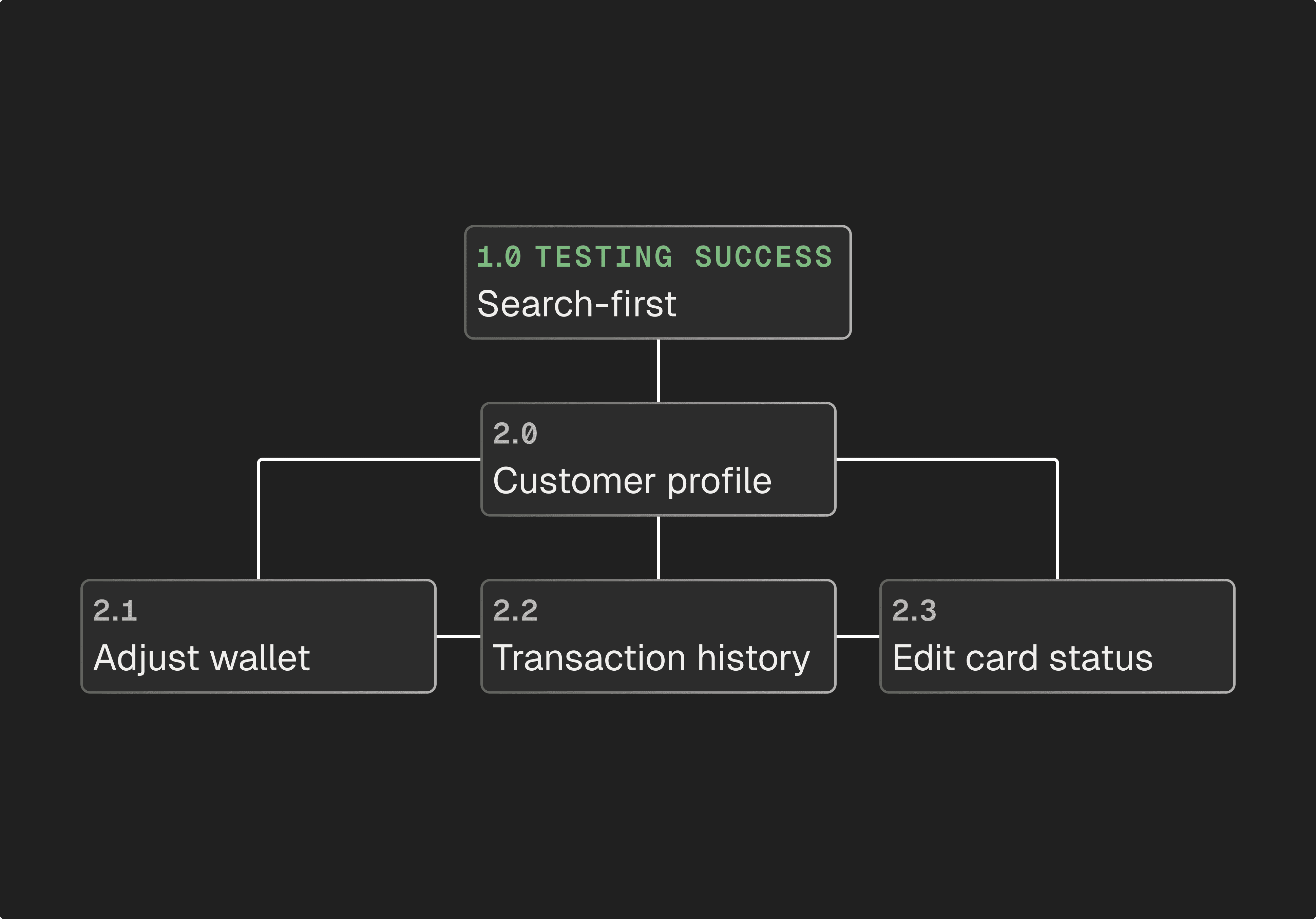
Pivoted to search-first landing page after dashboard view failed in testing
Outcome
First-time learnability rose to 85%. Advisors reach the customer they're looking for in under 5 seconds.
Constraint + problem
The initial dashboard concept tested poorly. In every R1 feedback session, advisors ignored it and looked for search.
Decision
The mental model wasn't "let's resume past sessions", it was "find a customer to conduct tasks now. I then scrapped the dashboard and search became the entry point.
Sometimes the best decision is to throw out two weeks of work.
Simplified architecture
Killing the initial agreed approach resulted in a much more simplified architecture. This was a big contributing factor in overall time on task reduction and first-time learnability.
Initial proposed architecture
Finalised architecture
IMPACT
100 tickets: from 4h10 → 2h15 + 50% daily completion.
Behind the numbers
I achieved this by removing friction points from most-used tasks - specifically wallet adjustments, customer search and customer transaction validation through advanced filters.
Users must be brought into the design process as early as possible when redesigning a legacy tool. This is exactly what I did, and it's paid off.
Operational scale
The Loyalty Admin Tool went live in March 2025, as Nando's began migrating over 10 million Loyalty accounts from Paytronix to the new provider.
This wasn't just a redesign of a tool, but it is the operational backbone of a massive loyalty programme in the UK.
Presenting in front of the Customer Team
There's 70 people in the audience here (I promise).
REFLECTION
Three things I'd do differently
Involve wider stakeholders earlier.
If I had brought everyone along for the journey like I did with the users it would have vastly improved buy-in.
Share research findings sooner.
Similarly with the above point - engineers would know exactly why I'm suggesting design patterns and features if I shared the reports long before the build.
Check both microphones before conducting an interview.
I may or may not have muted both my mic and the room's mic during a usability session. Something that's scarred me and now I diligently check 20 times before hitting record.
What's next?
V2 delivered impartial customer search, transaction drop-downs, and advanced filtering.
V3 is ongoing, informed by weekly check-ins with advisors through a dedicated Slack channel. The product is live and still being shaped by the people who use it.
Although the numbers are good, the thing that matters most is that 40 people daily no longer have to be shown how to use it by someone who struggled before them.
Nando's, Loyalty Admin Tool
How I increased daily support ticket completion by 50% redesigning a customer support tool
Key decisions I made behind the impact
Project Overview
Role: Lead Product Designer
Team: 01 Designer, 01 PM, 02 Engineers
Timeline: Nov 2023 - Apr 2024 (further updates ongoing)
Platform: Web
Status: Live since March 2025
+86% ease of use
Replacing nested menu navigation with search-first meant users could find customers much quicker
-27% time on task
Contextual filters and a restructured architecture cut the adjustment flow from 9 screens to 5
SUS score increased from 39 to 91
From "Poor" (39) to "Best Imaginable" (91) after redesigning the architecture with advisors and restructuring how admin tasks are conducted
Project Overview
Role: Lead Product Designer
Team: 01 Designer, 01 PM, 02 Engineers
Timeline: Nov 2023 - Apr 2024 (further updates ongoing)
Platform: Web
Status: Live since March 2025
-27% time on task
Contextual filters and a restructured architecture cut the adjustment flow from 9 screens to 5
+86% ease of use
Replacing nested menu navigation with search-first meant users could find customers much quicker
SUS score increased from 39 to 91
From "Poor" (39) to "Best Imaginable" (91) after redesigning the architecture with advisors and restructuring how admin tasks are conducted
PROBLEM
Design the replacement for a loyalty tool so broken, it had its own internal nickname: Pain-tronix.
Business context
In 2025, Nando's completed a two-year migration away from their loyalty provider, Paytronix, to a new platform - saving the business a handsome amount of change per year.
The ask was to initially replicate what Paytronix can do, but I saw the opportunity to vastly improve the daily experiences of the users.
*
"
User interview, Customer Support Team
"We've been asking for a replacement for over 5 years."
*
"
User interview, Safety & QA Team
"Honestly I only know how to use it because someone's shown me. I couldn't figure a lot of it out."
INSIGHTS
What was slowing users down and which features are must-haves for the MVP
Understanding how teams used Paytronix
We couldn't rebuild every feature Paytronix has, so I conducted a card sorting with 14 members, across 7 teams
The card sorting prioritised which features are most used and highest priority for the new tool
Identifying why tasks took so long
Below is the current Adjust Wallet flow mapped out
The most used task by every team currently has 9 separate screens and 17 actions to take
There are also multiple points of potential error with no safeguarding in place
Paytronix scored below SUS industry average
A System Usability Scale survey across 18 advisors scored Paytronix at 39
Industry average is 68 - below 50 is failing
This alone gave me leverage to push for the redesign of a tool that would suit both user and the business
Three core insights were derived from the research
The research surfaced three things the business hadn't fully anticipated:
01
The tool didn't just slow users - it broke their trust
13/14 users I spoke to had to build workarounds for their daily tasks, and were not happy needing to do so.
02
High-priority tasks were not easily visible
Card sorting ranked search and wallet adjustments as top tasks - both over 6 clicks deep.
03
Information density made the UI unlearnable
40+ fields with no hierarchy meant users spent 10-40 seconds locating basic customer information.
Users simply couldn't continue using the same tool. What they had to deal with on a daily basis was preventing them from working efficiently, and effectively.
DECISIONS
01
Reduced the wallet adjustment flow from 9 screens to 5 while decreasing the likelihood of high-impact errors
Outcome
Reduced time on task by 27% whilst decreasing high impact errors both in testing and once the tool was built.
Constraint
The tool needed to support high volume, reversible actions across 10M+ loyalty accounts. Mistakes were difficult to recover from.
Problem
In Paytronix, the flow took 17 steps across 9 screens.
There was no confirmation step, no visibility of the outcome, and no easy recovery from mistakes. Errors meant either contacting engineering or trying to reverse actions before customers noticing - like giving someone 100 Rewards.
Decision
One flow, not many - Replaced multiple entry points with a single modal and type selector.
Make outcomes visible before action - Introduced confirmation with pre/post balances and persistent customer context.
Default the common case - Pre-selected "Central Support" to remove a 500 restaurant scroll (Central Support was right at the bottom).
Final direction
A single focused flow with clear intent, visible outcomes, and reduced decision overhead. Engineering concerns about combining flows did not materialise in testing.
02
Filtering nearly didn't ship in the MVP - Here's how I fought, and won, the case for it
Outcome
In V2 testing, advanced filtering had the highest immediate task-success rate of any feature in the tool - 93%. Advisors can now find specific transactions in under 10 seconds.
Engineering proposal
It will save 2 sprints of build time if we include in the MVP
Save filtering for V2/V3
Can focus our attention on Adjust Wallet and Edit Card status
"Paytronix doesn't have this so it's fine."
My argument
Filtering in testing dramatically cut time on task by ~27%
Reduces cognitive load for users
Higher ticket completion, which is better for business
"I'll trade filtering for pagination in the MVP."
Without filtering
Up to 15 years of transaction data to scroll through
With filtering
Find transactions in 3-4 clicks
Transaction History with no filter or pagination
[ Current Paytronix functionality ]
What I traded to keep in scope
✕
Pagination → V3
✕
Filtering reduces cognitive load more effectively
✕
Expandable row → V2
✕
Users can leave admin info directly in adjust wallet form
✕
Link to Orders Hub → V3
✕
Users can still access by manually entering info
✕
Impartial search → V4
✕
No unhappy path sadly, but more users wanted filtering
✓
Result: Filtering shipped in MVP
✕
It's now the second most used feature in the customer profile
Most-used customer profile features
User feedback
The results from Google Analytics, and continuous conversations with all teams, show that filtering is an imperative feature to their daily workflows.
03
Pivoted to search-first landing page after dashboard view failed in testing
Outcome
First-time learnability rose to 85%. Advisors reach the customer they're looking for in under 5 seconds.
Constraint + problem
The initial dashboard concept tested poorly. In every R1 feedback session, advisors ignored it and looked for search.
Decision
The mental model wasn't "let's resume past sessions", it was "find a customer to conduct tasks now. I then scrapped the dashboard and search became the entry point.
Sometimes the best decision is to throw out two weeks of work.
Simplified architecture
Killing the initial agreed approach resulted in a much more simplified architecture. This was a big contributing factor in overall time on task reduction and first-time learnability.
Initial proposed architecture
Finalised architecture
IMPACT
100 tickets: from 4h10 → 2h15 + 50%
daily completion.
Behind the numbers
I achieved this by removing friction points from most-used tasks - specifically wallet adjustments, customer search and customer transaction validation through advanced filters.
Users must be brought into the design process as early as possible when redesigning a legacy tool. This is exactly what I did, and it's paid off.
Operational scale
The Loyalty Admin Tool went live in March 2025, as Nando's began migrating over 10 million Loyalty accounts from Paytronix to the new provider.
This wasn't just a redesign of a tool, but it is the operational backbone of a massive loyalty programme in the UK.
Presenting in front of the Customer Team
There's 70 people in the audience here (I promise).
REFLECTION
Three things I'd do differently
Involve wider stakeholders earlier.
If I had brought everyone along for the journey like I did with the users it would have vastly improved buy-in.
Share research findings sooner.
Similarly with the above point - engineers would know exactly why I'm suggesting design patterns and features if I shared the reports long before the build.
Check both microphones before conducting an interview.
I may or may not have muted both my mic and the room's mic during a usability session. Something that's scarred me and now I diligently check 20 times before hitting record.
What's next?
V2 delivered impartial customer search, transaction drop-downs, and advanced filtering.
V3 is ongoing, informed by weekly check-ins with advisors through a dedicated Slack channel. The product is live and still being shaped by the people who use it.