Regressive Disclosure
Lettting users decide relevant information through dense UI.
02 / process
3 mins read

In my time at Nando’s I’ve designed a few internal tools. My main goal for these redesigns is showing the right level of information on the surface, but I struggled at first with understanding what should be shown where. This led to a lot of feedback sessions back and forth where I would draft up an interface, “What about this?”, “How about this?”
Then it dawned on me - I wonder if I dump a lot of information, knowing full well that it wasn’t going to stay, and let the users decide which is relevant for them and their roles. This may not be a revolutionary way of working, but it expedited this project in particular massively.
This is what I call Regressive Disclosure. Different from Progressive Disclosure in that the user doesn't have to click into a component to see more information, but rather the user is determining what should be shown in the design during testing. The regression is the design evolving into a simplified state, but the secret sauce is that only imperative information is shown.
This method not only created less guesswork, but it allowed users to see everything all at once and really figure out what is necessary at first-glance. It allowed them to design this tool specifically for their team’s needs, and the tool is now a success.
Information dump - all data points visible on the frame. As you can see below this is not a shippable interface, and that's the point. Which information shown here is critical at first glance?
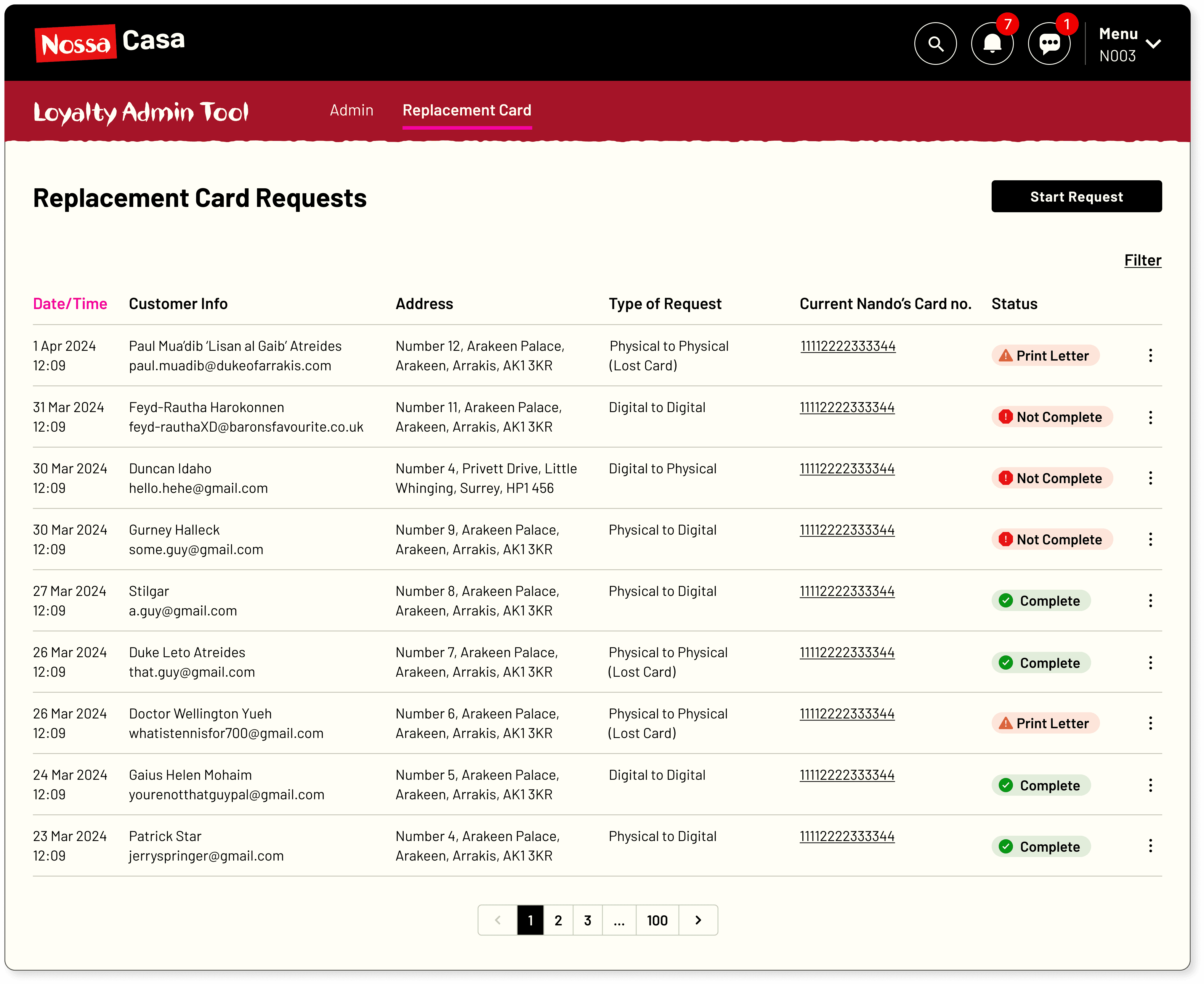
Users determine what is necessary through testing - they whittled down the necessary fields in the table to the five most crucial to see at a quick glance.
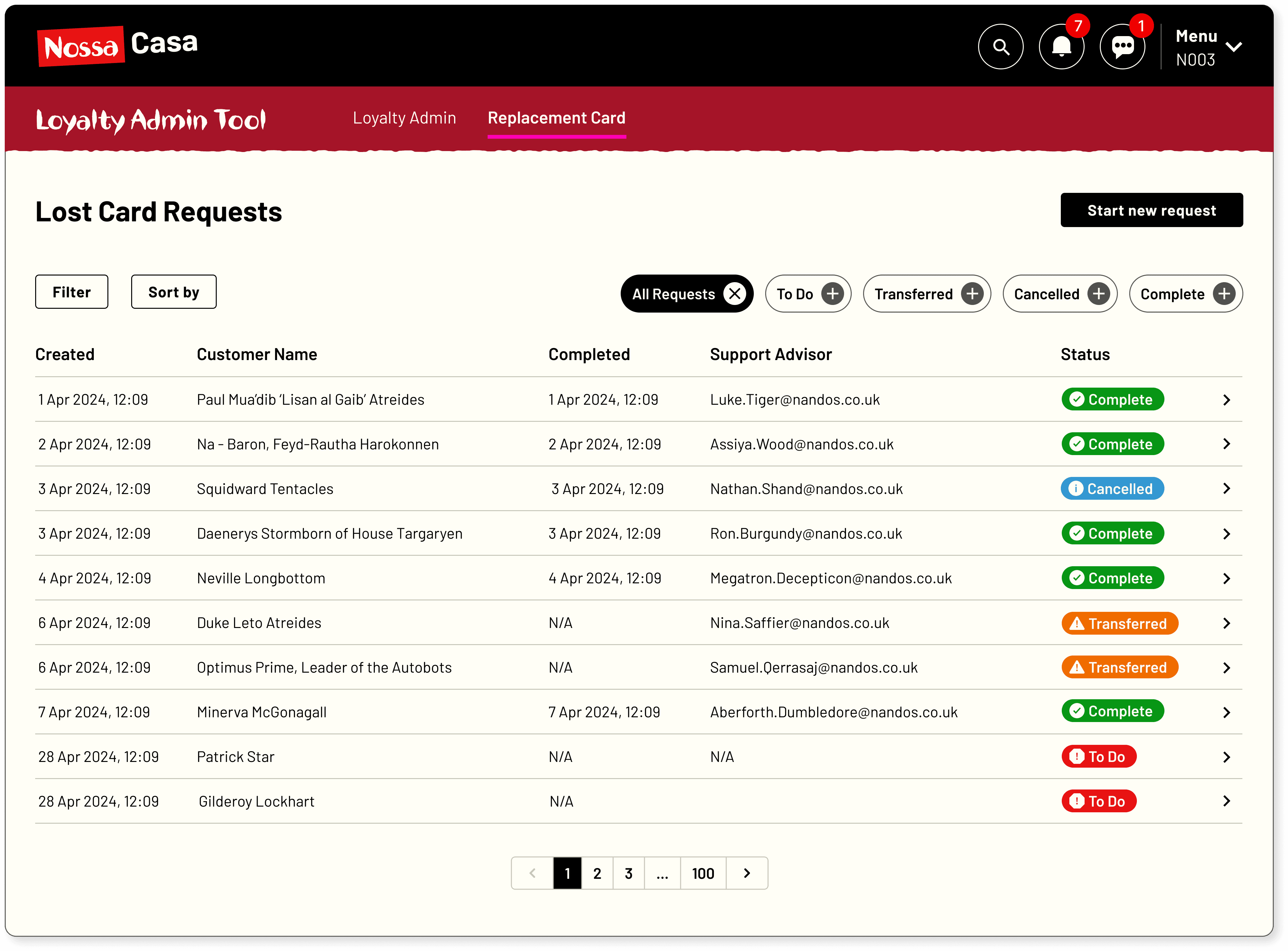
Progressive disclosure can then be used effectively as you now know what has to be shown where - a lot of the side-drawer information was initially shown in the first iteration.

Product design made simple (wink).